Account Summary & Account details Redesign
Time Line
2024 - 2026
Role
Experience designer
Teams
Mobile Team
Accounts product team
Bank 1 Dev team
Tools
Figma
Sketch
Firebase
TestFlight
the brief
The heart of the everything.
Accounts Hub is the face of the whole app, the gate to all features after log in. It’s not a single feature, but a navigation concept of the beginning of a user journey. The redesign of Accounts Hub aims to improve app structure and user navigation, while maintain a clean yet efficient look.
impact
It’s a beautiful well-guided map to success!
- Overall navigation was rated “Much Better” (92% satisfaction) in the new design.
- Customers liked how the information is lined up and easier to see than before - 65% thinks it’s better, 30% thinks it’s the same.
- Customers liked the new app design overall, calling it streamlined, sleeker, easier, and more modern.
- Some nice-to-have features were favored due to their attractiveness and high importance rating.


92% Satisfaction
Navigation is “much better”

65% Satisfaction
information is easier to see


streamlined, sleeker, easier, and more modern
Problems & challenges
Everything, everywhere, all in once.
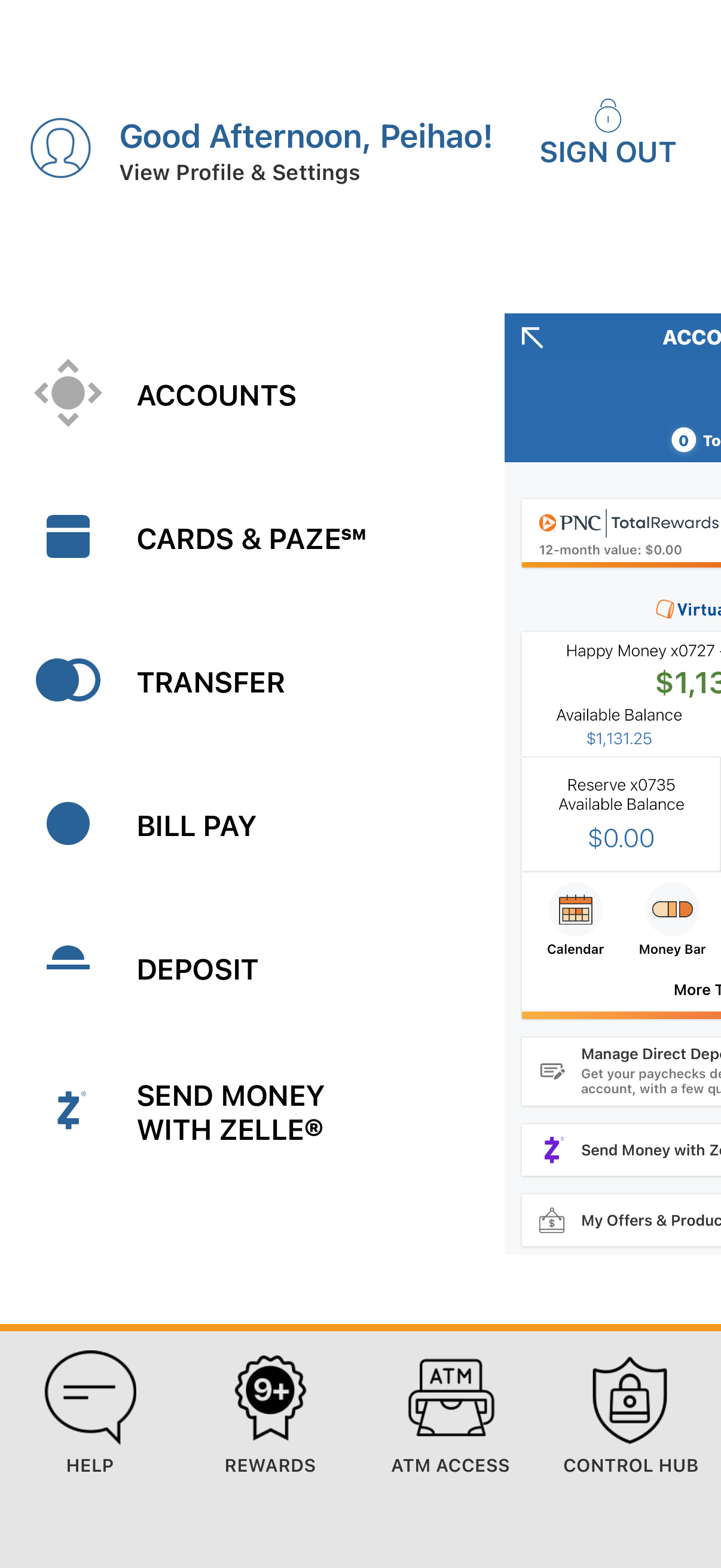
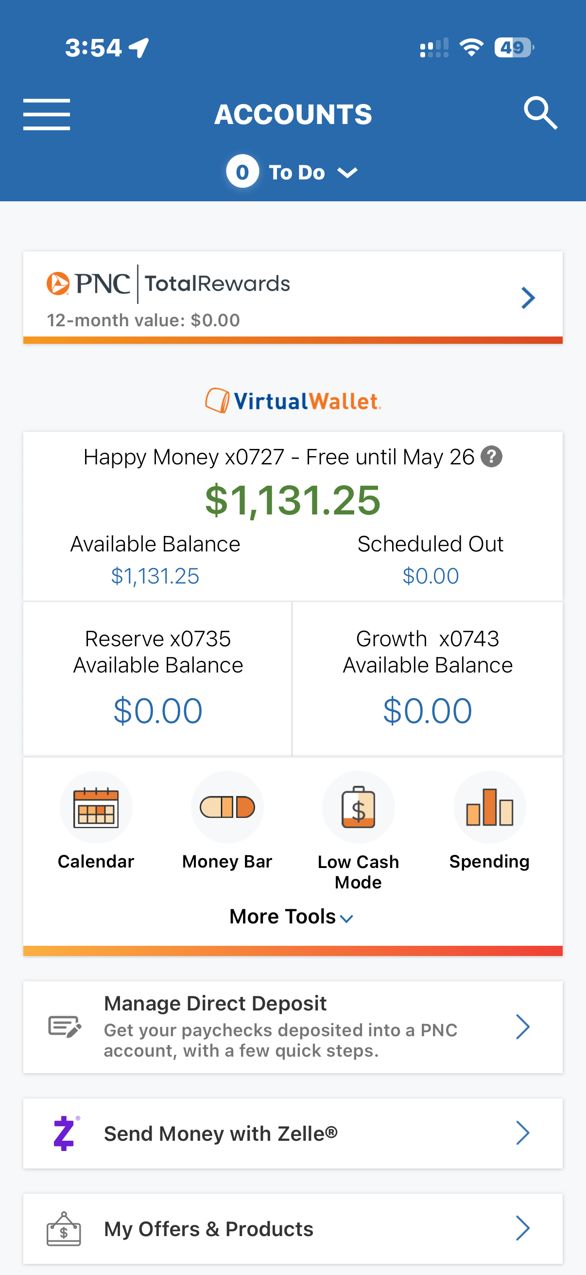
Based on research and user studies, the biggest usability challenges stem from confusing navigation, inconsistent information architecture, an outdated visual design, and overlooked features that have accumulated over years of iterative updates.
Navigation
Customers have more difficulty navigating to key features and tools in the PNC app than the industry average (56% vs. 67%).
Satisfaction Rate
27% - 29%

Visual Appeal
A lack of significant UI modernization over the past 7 years has left PNC's app below current industry design standards and behind major competitors in UX.
Satisfaction Rate
26% - 31%

Account Overview
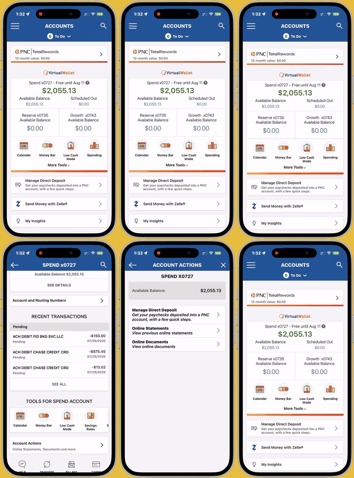
Customers struggle to find important information and instructions because account page content is cluttered, inconsistent, and poorly organized.
Satisfaction Rate
17% - 19%

Sub-Features
Full account & routing numbers and statements are infrequently accessed, causing customers to have difficulty locating them each time they need them.
Satisfaction Rate
28%

Double navigation
disorganized entries
outdated visuals




insights
The navigation, the grouping, the hide-away, the nice-to-have.
Insights from internal & external research, user testing, analysis, and J.D. Power.
Bottom navigation is the predominant navigation theme used by nearly all the profiled banking apps as it provides quick access to key journeys.
Checking balances and transactionsare most related in customers’ minds, and they are seen as interconnected.
Customers prefer a simple, consistent interface that prioritizes frequently used features while keeping secondary actions accessible through deeper navigation.
Customers found both swipe actions and expand/collapse/pin features attractive, with expand/collapse offering the greatest value for organizing content. Despite being unfamiliar in banking apps, swipe actions were well received and considered intuitive to use (6.7/7).
SOLUTIONS
Building a smarter banking experience, one layer at a time.
- Building a new design system to establish consistency, scalability, and a unified visual language across the app.
- Redesigning navigation with a focus on intuitive user flows, feature prioritization, discoverability, and future scalability.
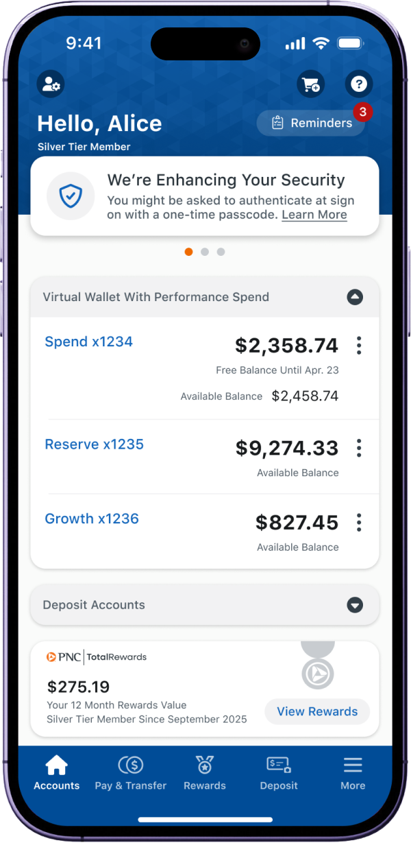
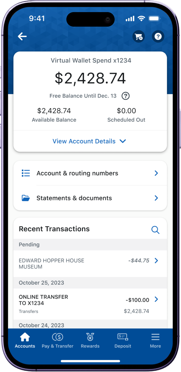
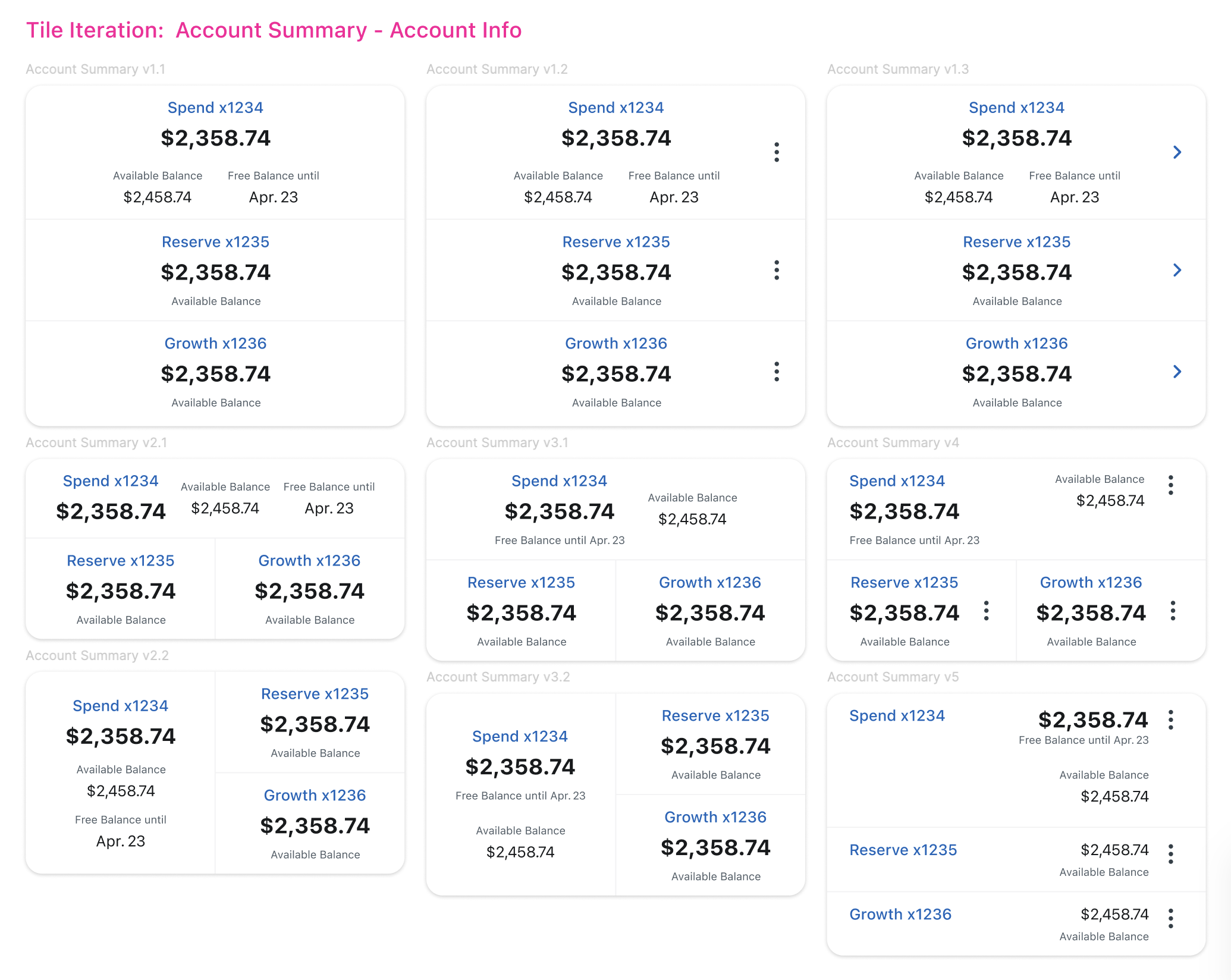
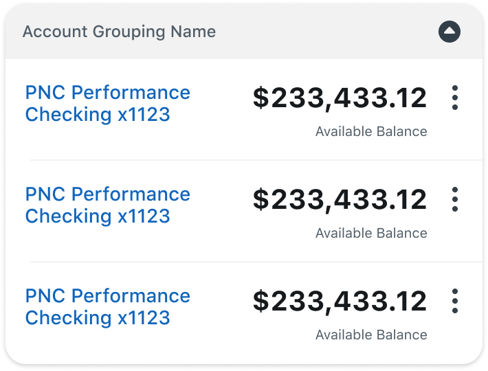
- Restructuring account summary and details to improve information hierarchy, content grouping, and access to relevant features.
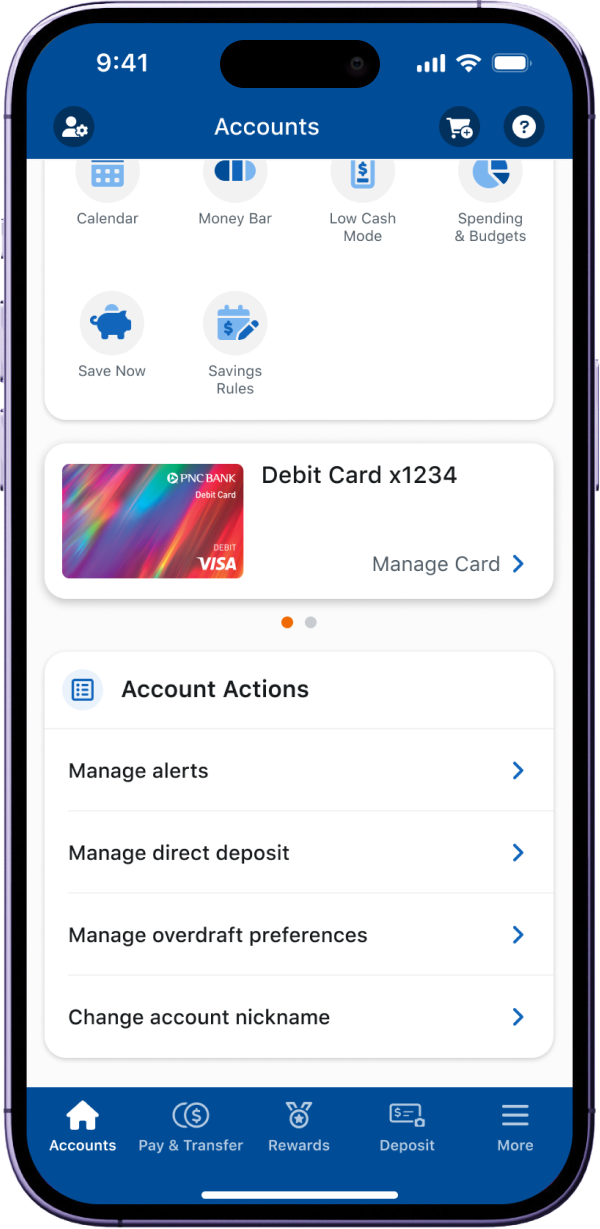
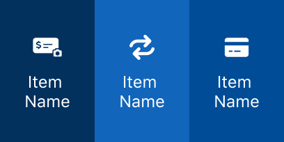
- Introducing swipe actions as power-user shortcuts, providing faster access to common tasks while maintaining alternative navigation paths.
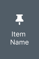
- Adding expand/collapse/pin capabilities to help customers with multiple types of accounts personalize, organize, and manage their account views.

embracing Bottom navigation
Restructuring account Information Refining Transaction display
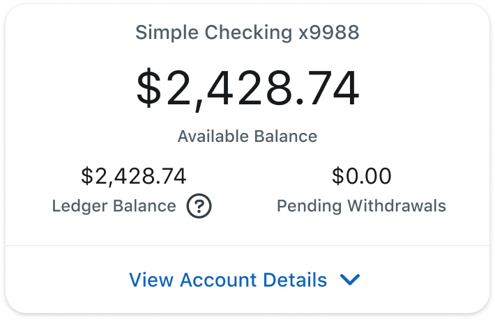
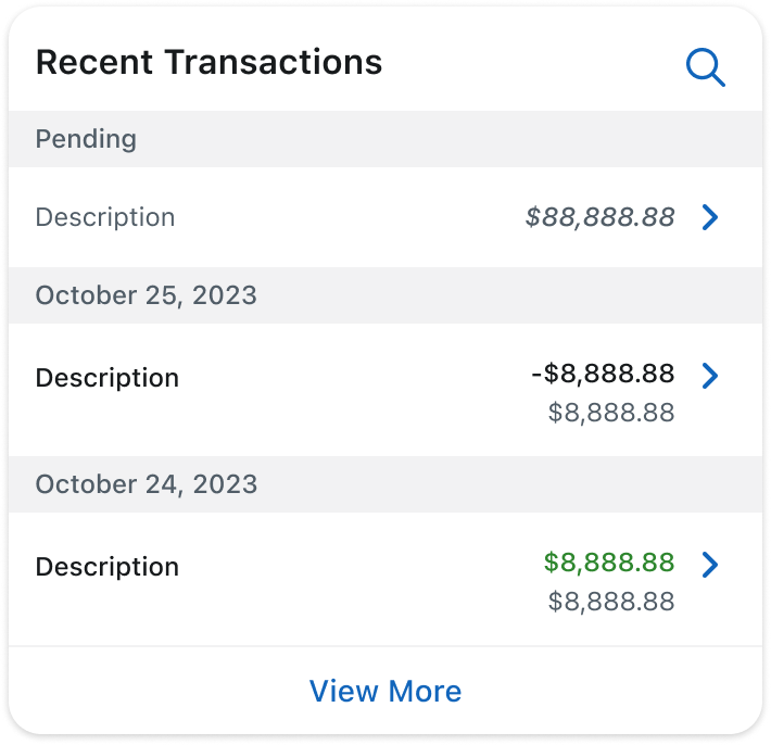
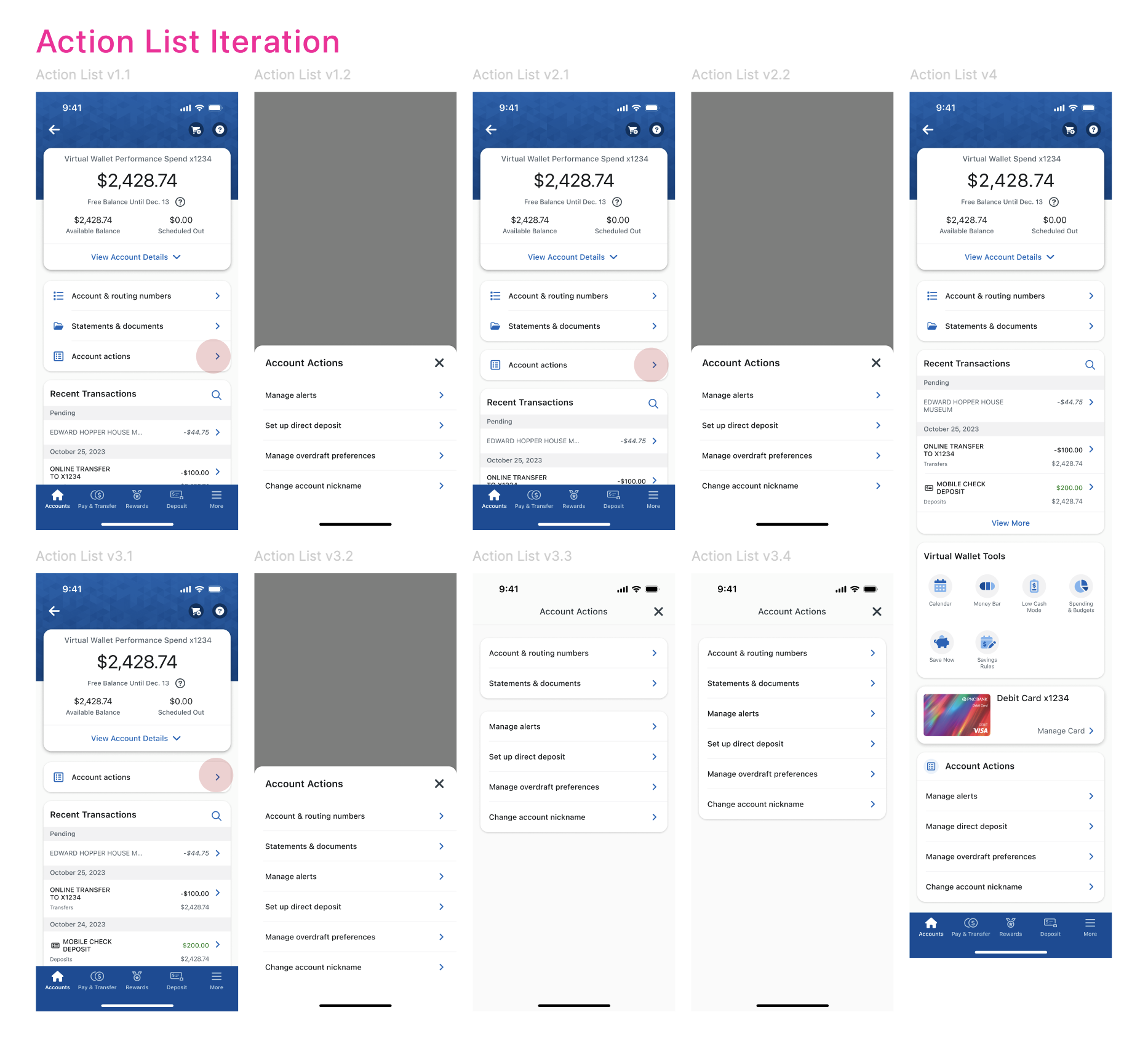

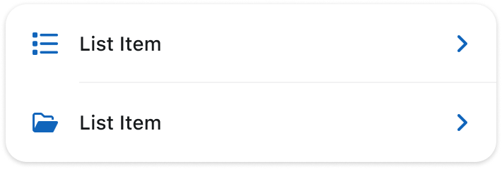
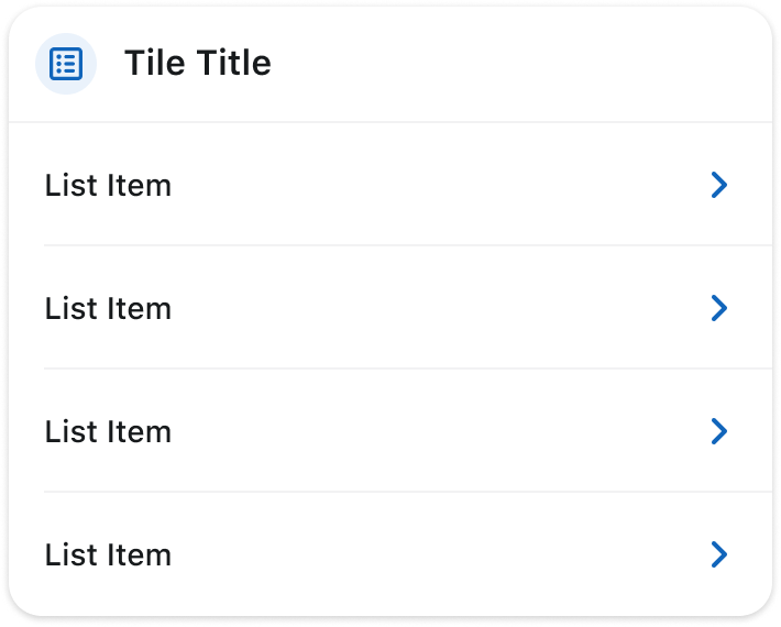
Surfacing account & routing number with statements grouping relevant feature entry points
Swipe / Expand / Collapse / Pin

OUTCOMES
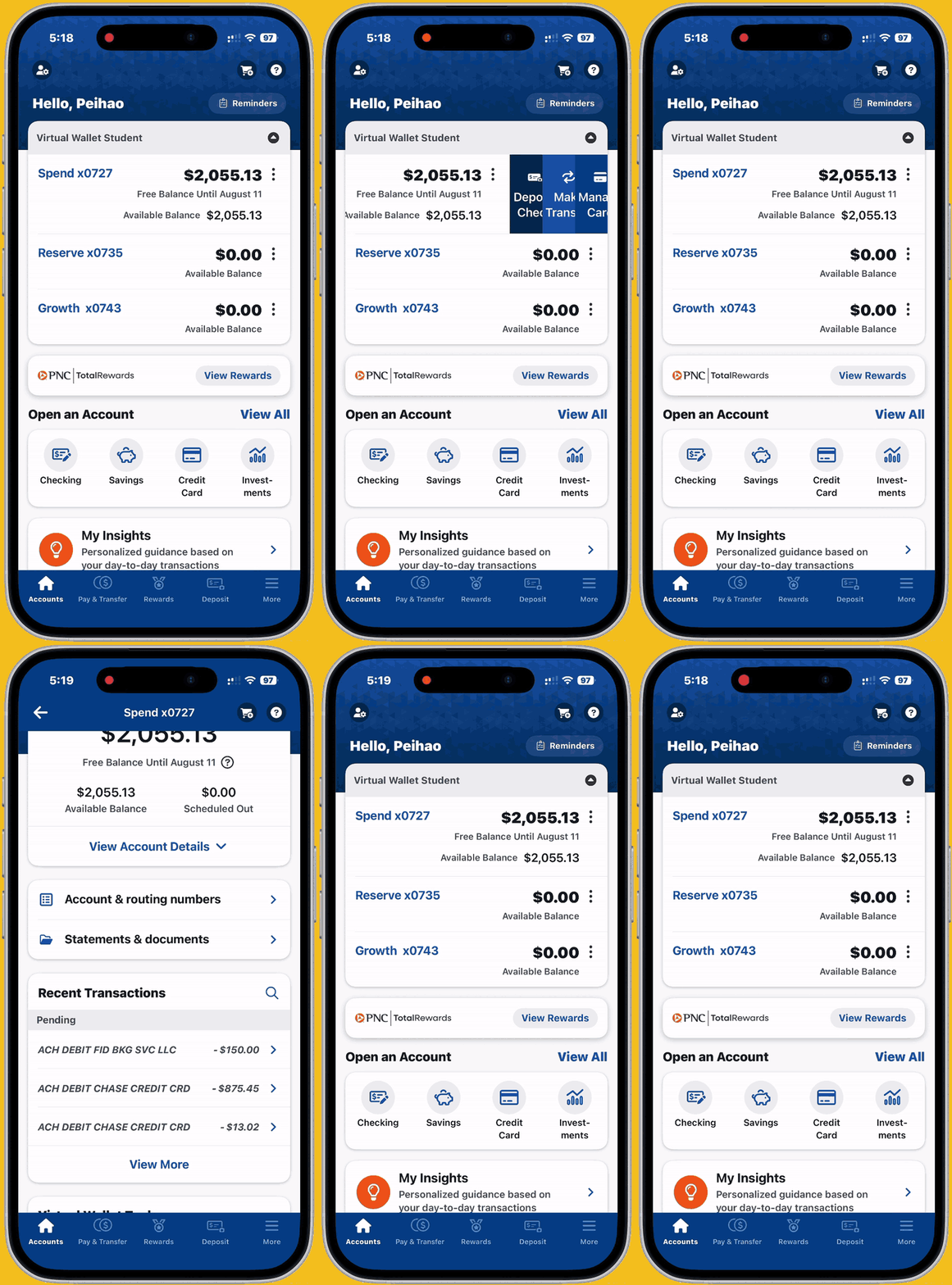
A new look, a better flow!
- Modernized and consistent visual design with concise, structured information and intuitive navigation.
- Persistent bottom navigation across key feature hubs for easier access and discoverability.
- Seamless access to account information and transactions through improved content organization.
- Convenient one-tap access to enhanced interactions, including swipe actions and expand/collapse/pin features.
CONTRIBUTION
Feeling like an architect again.
As the leading designer on this feature, I felt like the architect holding the blueprint. The Accounts Hub is the foundation of the new app — every decision I made had an impact on the standards and guidelines for other features, design system, page layout, information grouping, worksheet style, interaction behavior, and more. I take pride in what I’ve accomplished, and in the road I paved for those who came after me.
RETROSPECT
Imperfectly perfect.
Praises:
- Customers responded positively to the redesigned app, describing it as more streamlined, modern, sleek, and easier to use.
- The updated design language feels consistent, incorporating modern UI patterns such as rounded corners, visual effects, and refreshed components.
- Customers valued the improved account summary layout, with 65% rating the new design as better and 30% viewing it as equal to the previous experience.
- Finding account and routing numbers and statements showed significant improvement, with 92% of customers rating the new experience as “Much Better.”
- Customers understood and responded positively to swipe actions, with a high likelihood of using the shortcuts in the future.
- Expand/collapse/pin functionality was well received as a way to improve content organization and page usability.
Flaws:
- The visual experience could be enhanced through more strategic use of color; customers noted that the app relies heavily on blue, creating a monotone feel across visuals and navigation.
- Customers requested that expand/collapse preferences be saved across app sessions for a more personalized experience.
This case study has been condensed due to NDA restrictions, feel free to reach out for more details.

antoniphzh@gmail.com
